War and the Mind at the Imperial War Museum London
Exploring the Psychological Dimensions of Conflict
Studio Scamps collaborated with PLAID Design Studios to create the 2D graphics for War and the Mind, a powerful exhibition at the Imperial War Museum London. The exhibition examines the psychological elements of conflict, from the First World War to the present day, and delves into how war influences human thought, behavior, and perception. Our role was to design graphics that would not only communicate these complex ideas but also resonate with a broad audience.
The graphic design approach focused on transforming academic text into accessible, expressive visuals. Wrinkled posters—used throughout the exhibition—served as a literal interpretation of deconstructing text, inspired by the aesthetic of war propaganda. This layering technique, paired with bold typography and evocative hand-drawn elements, helped bridge intellectual concepts with intuitive understanding.
To support the exhibition’s overall theme, we used ReBoard card for the Section panels, giving the design a paper-like texture along with four theme panels which were mounted on wheat-paste style posters, further connecting the graphics to the war propaganda aesthetic while providing a tactile, deconstructed feel. Typography was layered, blocking quotes over evocative handwriting to intensify the emotional response.
The exhibition’s four themes were also encapsulated through evocative collage illustrations, using a colour palette that leaned towards the clinical and utilitarian, reflecting the exhibition's forensic and objective focus.
3D design: PLAID London
Lighting: Luminance Lighting Design & Jonathan Howard Ratty
Audiovisual production: IWM, Clay Interactive and Liminal
Exhibition build: Scena
Graphic production: Displayways
500sqm £250k
Images © Imperial War Museums
This exhibition marked the 200th anniversary of the modest beginnings of Norwegian emigration to the United States. Featuring artefacts from the National Library of Norway, it explored the motivations, misconceptions, and fears of 19th-century Norwegians embarking on the journey—and the often harsh reality of arriving in an unfamiliar land and attempting to build a new life.
Using printed voiles to create large-scale imagery and an aurora-inspired motif, we designed a dreamlike environment that captured the hopes, illusions, and aspirations of those first travellers. At the centre of the space, a glowing lightbox displayed facsimiles of key archival material, framed by a soft, orb-like glow. This ethereal lighting contributed to the immersive atmosphere, washing the space with shifting colour and light.
The layered visuals and translucent materials reflected both the promise and uncertainty of venturing into the unknown. The typographic approach drew inspiration from early Americana woodblock prints, reinforcing the period character and visual language of the time.
3D design: Plaid
Lighting: National Library of Norway
Exhibition build: National Library of Norway
Graphic production: Konsis & Displayways
157sqm
London: Port City Exhibition at the Museum of London Docklands brought to life 200 years of London’s ports — a sensory journey through sights, sounds, and scents. For generations, these ports stood as Britain’s gateway to the world. Collaborating with 3D designer Hara Clark, the gallery underwent a stunning transformation into a visual reverberation of a bustling port warehouse.
In this dynamic project, my focus was on seamlessly integrating graphics into the exhibition's fabric. Stylised and intricately designed images were directly printed onto the wooden surfaces of showcases inspired by packing crates. This deliberate choice not only conveyed the authenticity of a warehouse setting but also created a unique visual experience. As visitors explored the gallery, a mesmerising parallax effect unfolded, with images spanning across crates, offering a dynamic and captivating journey.
Beyond images, thematic coherence extended to labels. Printed on wooden sheets, they harmonised with the overall aesthetic, mirroring the typography found on branded crates. This meticulous attention to detail elevated the visual appeal and contributed to an immersive narrative, transporting visitors to the historic world of London's ports.
3D design: Hara Clark
Lighting: DHA Designs
Audiovisual production: Clay Interactive
Exhibition build: Central Leisure Developments
Graphic production: BAF Graphics
250sqm £80k
茶, चाय, Tea' at the Horniman Museum allowed us to explore both 2D and 3D design, cultivating a space that transcends typical representations of tea culture.
Collaborating with community groups and historians, the co-produced interpretation uncovers diverse narratives woven into Britain's national drink. Reframing the traditional view, we embraced a design approach mirroring the inclusivity and richness of tea culture.
The exhibition space serves as a canvas for community stories, with choices like hanging voile ceiling drapes and section panels as printed canvas sheets stretched across bespoke timber frames.
Every detail, from graphics to the title treatment featuring coloured tea-stains, reflects the diverse communities converging for this project. These tea-stains symbolize the unity found in the shared appreciation of tea.
The exhibition delved into Britain's colonial past, examining tea's role and challenging historical marketing stereotypes. Sensitively addressing the environmental impact and conditions for tea farm workers, '茶, चाय, Tea' is more than an exhibition; it's a nuanced exploration of tea's multifaceted culture and history.
3D and 2D design: Studio Scamps
Exhibition build: Workhaus
Graphic production: Displayways
174sqm
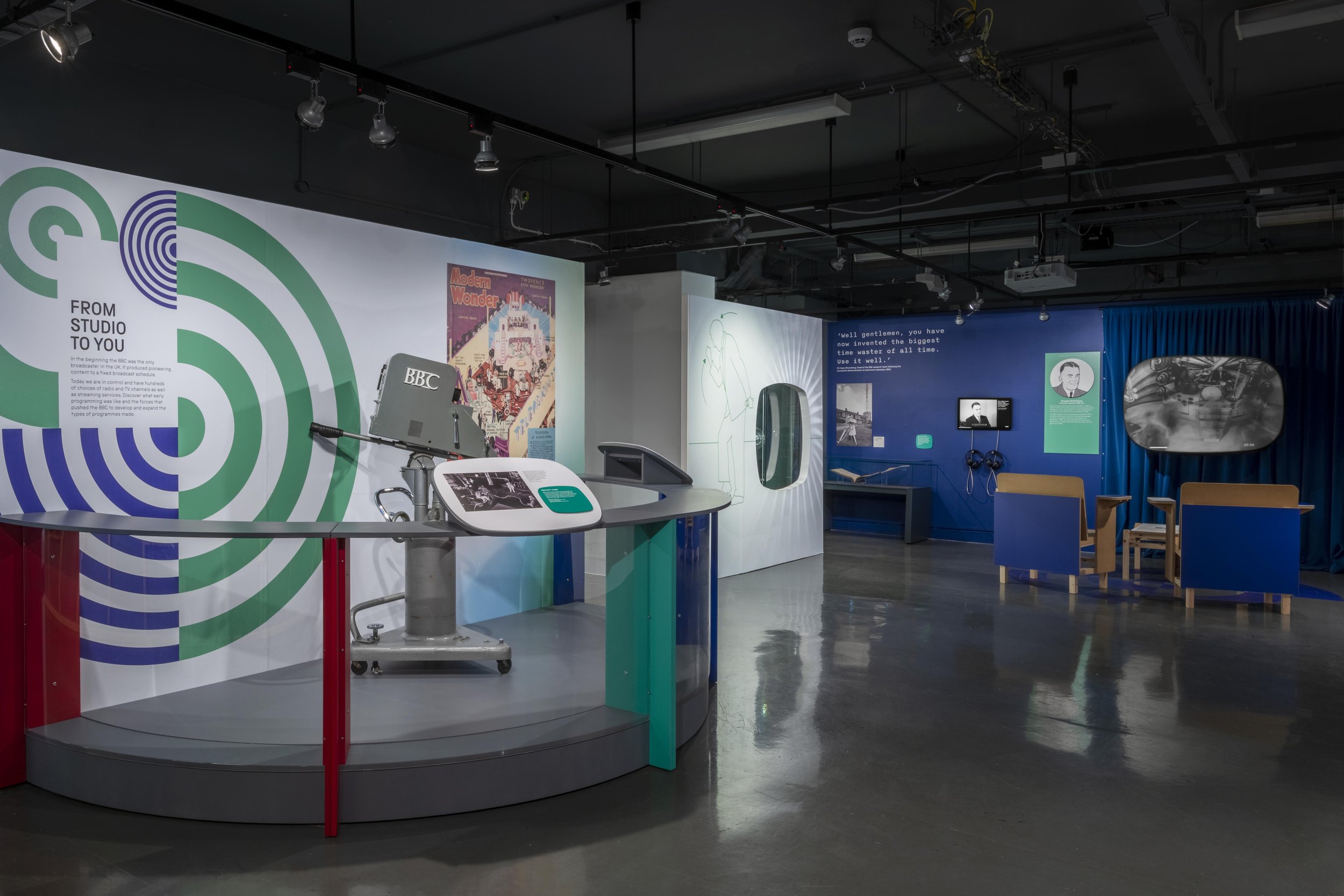
Collaborating with PLAID, we contributed to the Switched On exhibition at the Science and Media Museum—a standout in the #Broadcast100 celebration, marking the BBC's 100th and Channel 4's 40th anniversaries.
Switched On showcased effective collaboration between 3D and 2D design. With PLAID, we crafted an environment evoking mid-century TV graphics, drawing inspiration from broadcaster insignia and logos. Graphics complemented PLAID's 3D vision, featuring bare timber frames, capturing vintage TV charm.
Geometric graphics took centre stage, illustrating information dissemination, community connection, and technological advancement. Bespoke illustrations highlighted achievements of icons like David Attenborough and Reed Hastings, Netflix's founder.
The colour palette was inspired by the Red Green an Blue sub-pixels essential for TV broadcast, infusing the exhibition with vibrant energy echoing broadcasting history.
Switched On, beyond nostalgia, leaps into the future. New broadcast technology is examined that transforms viewers into active participants. Weather reports dance on furniture, football matches unfold outside windows, and talent shows invite visitors to take centre stage as the exhibition attempts to imagine what home entertainment may look like.
3D Design: Plaid
Exhibition Build: Hadley Interiors Ltd
Audio visual: Ay Pe
Client: Science and Media Museum
490sqm £160k
Images © The Board of Trustees of the Science Museum
Gold: Spectacular Manuscripts from Around the World at the British Library is an enchanting exploration of 50 illuminated texts and manuscripts spanning 1,500 years, representing twenty countries.
Within the intimate confines of the British Library, the exhibition unfolds in cavernous blue voids meticulously designed to showcase a dazzling collection of manuscripts. This presentation not only captivates the audience but also evokes a sense of intrigue and discovery within a compact space.
Inspired by the art of ink scripting and the intricate gold mining process, the exhibition design goes beyond traditional displays. Imagine stepping into a world where visitors embark on a journey akin to miners, eagerly searching for precious finds. The exhibition walls, wrapped in dyed canvas material, emulate a rough rock face, creating an immersive experience. Panels, printed on smooth painted wood, mimic the appearance of being carved into the rock, adding an extra layer of authenticity.
The typographic style employed echoes the grace of calligraphic writing, intertwining seamlessly with the overarching theme of precious manuscripts adorned with gold. The result is not just an exhibition; it's a sensory exploration of time, craftsmanship, and the allure of gilded manuscripts..
3D design: Hara Clark
Lighting: DHA Designs
Exhibition build: Central Leisure Developments
Graphic production: Displayways
The Prince Philip Maritime Collections Centre is home to the Royal Museums Greenwich stored collections and state of the art conservation studios.
This PPMCC is full of inspiring objects which, are generally out of public view. Through a series of behind-the-scenes tours and open days, this state of the art new facility will allow visitors to see the collection and some of the valuable conservation work which takes place there.
A series of panels were designed to aid the tours and help visitors understand the museum collection and conservation work. Inspired by the periodic table, the design features on panels which explain key considerations for conservation and significant case-studies.
Insight Astronomy Photographer of the Year - an annual international photography competition
• Working with HaraClark, production of exhibition graphics featuring light boxes as display panels and signage
• Created graphic language for the competition, for use in exhibition, competition website and printed materials
• The graphics kept a contemporary scientific feel and made the competition categories accessible to visitors and entrants
4 large honeycomb board structures produced for the Royal Museums Greenwich as part of an education project with Mulgrave Primary School.
Using content from two year four classes, we created two ships figureheads that represented the children’s beliefs. The designs took the form of a squirrel and the footballer/philanthropist Marcus Rashford as representation of their beliefs in the environment and caring for people.
Ministry of Stories helps young people in east London discover their confidence, imagination and potential through focused and fun writing workshops.
Working with the organisation and the young people of Hackney we produced a 6pp promotional leaflet mimicking a packed school bag full of writing drawing and activity sheets capturing the after-schools session’s opportunity for creative expressions.
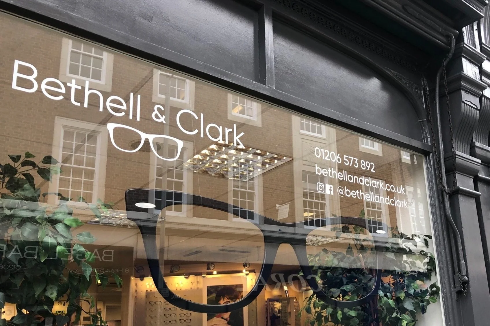
A contemporary brand mark for a long established optometric practice in historic Colchester.
The brand was used on a number of promotional items which would highlight the practice’s strong connection to the town.
A risograph is a digital printing machine with a process that mimics screen printing.
Inspired by house party experiences and the revitalisation of Electronica, this limited edition is available to buy.
Illustrations for a limited edition poetry pamphlet by poet Tom Sharp. Designed by The Beautiful Meme. Inspired by Pan, the horned god, the english village, the English and pagan symbolism.
Book cover design for the memoir from N J Campbell. This uplifting, humorous and inspiring story is about illness, serendipity, love and endeavour.
The Pop-up museum was a unique space set up in a south London shopping centre by National Maritime Museum as part of the 'Travellers Tails' project. The Pop-Up museum formed part of the NMM's community outreach strategy.
• Designed graphics for the space, creating an inviting area for shoppers to enter and explore themes of exploration
• Window vinyls, floor vinyls and large scale graphics were used to create a hybrid between a heritage site and retail unit.
Experian plc is a multinational consumer credit reporting company.
Working with marketing agency JPC I created a large illustration to be projected in the Experian Customer Innovation Experience (CIE). The Customer Innovation Experience brings Experian's market leading propositions and innovative capabilities to life through explicable graphic sand animations. I illustrated a fictional area of world landmarks created to overlay financial statistics for various countries.
A vibrant illustration capturing the energy and feeling of hip hop and street dance! Available to purchase here. Ideal gift for a DJ, dancer or fan of music.
A limited edition of 100 Risograph prints on A4 (210mm x 297mm) 200gsm Echo 100% recycled paper. Signed, numbered and made up of 3 colours including fluorescent pink. Ships flat and unframed in a board backed envelope.
Note: Printed on an original Risograph printer, which naturally provides slight variations in the print and alignment. This method gives every print a unique and imperfect charm.
A leaflet detailing how to become a museum donor contributing to the redeveloped Geffrye Museum opening in East London. An vector illustration was created to support the words of The Poetry of it All that highlight how The Geffrye will reveal and rethink the ways in which we live.
An exhibition for the Royal Horticultural Society, highlighting our centuries old practice of cultivating plants for medicinal purposes. Graphic panels were produced featuring a dynamic graphic layout and supported by a ‘leaf-man’ image.
Various visualisation sketches (scamps) produced to realise various agency’s 2D and 3D concepts.
Scamps provide a swift way to represent a complex idea an aid a presentation to clients or gain consensus from a creative team. Please get in touch if you require support for a presentation.
Inspired by the broadsides of the 1800’s I regularly produce political and satirical cartoons and illustrations.
A trail designed to guide young visitors around the key art landmarks World heritage site of Greenwich.
Lambeth Landscapes is brand for the Parks and Grounds maintenance team of Lambeth Council. After ending a contract with external contractors, Lambeth wanted to create a strong and recognisable identity for the inhouse team.
• Creating a graphic mark in keeping with the Lambeth council brand and incorporating key landmarks from some of Lambeth's parks
(For Lambeth Landscapes enquires contact Lambeth Council. Studio Scamps is only responsible for the design of the logo.)
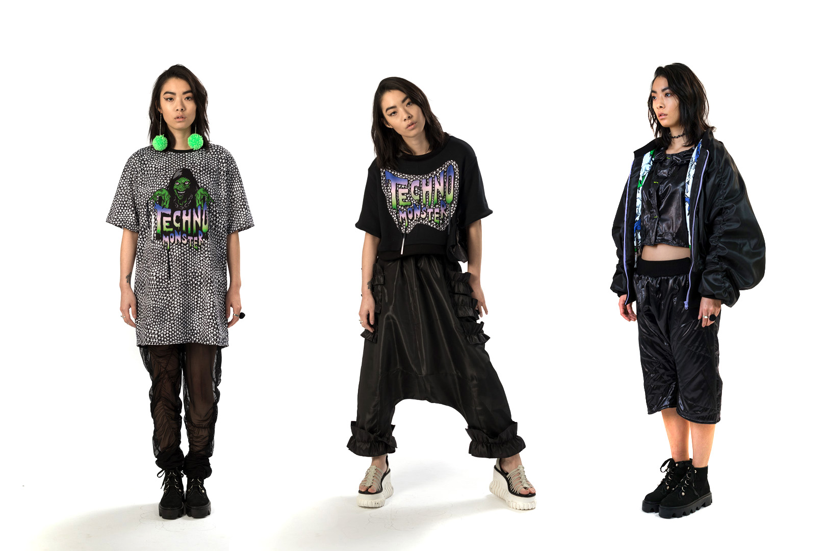
Lu La-Loop is a London-based fashion brand and independent knitwear label. Techno Monster was a collection inspired by the dark underground music scene of Berlin.
• Created fun and creepy illustrations for selected garments which were inspired by vintage horror comic characters
War Artists at Sea is a programme of displays in the Queen’s House, Greenwich showcasing the best of Royal Museums Greenwich’s collection of First and Second World War art.
• Designed graphics and type treatment, which were inspired by the 'dazzle camouflage' utilised during World War I on battleships.
A range of retail products that celebrate Greenwich becoming a Royal borough, designed for the National Maritime Museum and aimed at a youthful market.
• Graphic mark and identity were designed and reproduced on a host of products from crockery to T-shirts
• The playful graphic and typography mixed the contrary worlds of punk and monarchy
A selection of graphic marks produced for various projects.
A personal illustration project.